Appearance
Customizing the EC Quote Trigger Button
After EC Quote is installed on your website, you can customize the button from the EC Quote admin settings. These settings let you control the button text, spacing around the button, button styling, and the quote UI theme without changing the embed code on your website.
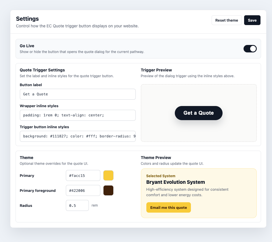
Go Live
Use Go Live to show or hide the EC Quote trigger button for the current pathway.
When Go Live is on, the quote button appears wherever the <ec-quote></ec-quote> element is installed. When Go Live is off, the button is hidden, but the installation code can stay in place.
TIP
Turning off Go Live is the intended way to temporarily remove EC Quote from a page. Only remove the <ec-quote></ec-quote> custom element from your website if you are fully uninstalling the plugin from that location.
Button Text
Use Button label to change the text shown inside the trigger button.
Examples:
Get a QuoteStart My EstimateRequest PricingBuild My System
If the field is left blank, EC Quote falls back to the default quote button text.
Wrapper Styles
Use Wrapper inline styles to control the area around the trigger button. This is useful for spacing, alignment, and page placement.
For example:
css
padding: 1rem 0; text-align: center;Common wrapper style options:
| Goal | Example |
|---|---|
| Add vertical spacing | padding: 1.5rem 0; |
| Center the button | text-align: center; |
| Add space above the button | margin-top: 2rem; |
| Center with flexbox | display: flex; justify-content: center; |
Wrapper padding controls the space outside the button. Use this when the button feels too close to surrounding content.
Trigger Button Styles
Use Trigger button inline styles to style the button itself. This controls the button color, text color, border radius, internal padding, width, shadow, and similar CSS properties.
For example:
css
background: #111827; color: #fff; border-radius: 999px; padding: 14px 30px;Common trigger button style options:
| Goal | Example |
|---|---|
| Change button color | background: #111827; color: #fff; |
| Round the button | border-radius: 999px; |
| Adjust button padding | padding: 14px 30px; |
| Make the button wider | width: 100%; max-width: 320px; |
| Add depth | box-shadow: 0 10px 24px rgba(17, 24, 39, 0.18); |
Button padding controls the space inside the button, around the label.
Theme
The Theme settings control the primary styling used throughout the quote UI.
| Setting | What it changes |
|---|---|
| Primary | The main action and highlight color. |
| Primary foreground | The text color used on top of the primary color. |
| Radius | The corner roundness of quote UI elements, measured in rem. |
Use Reset theme to remove custom theme overrides and return to the default EC Quote styling.
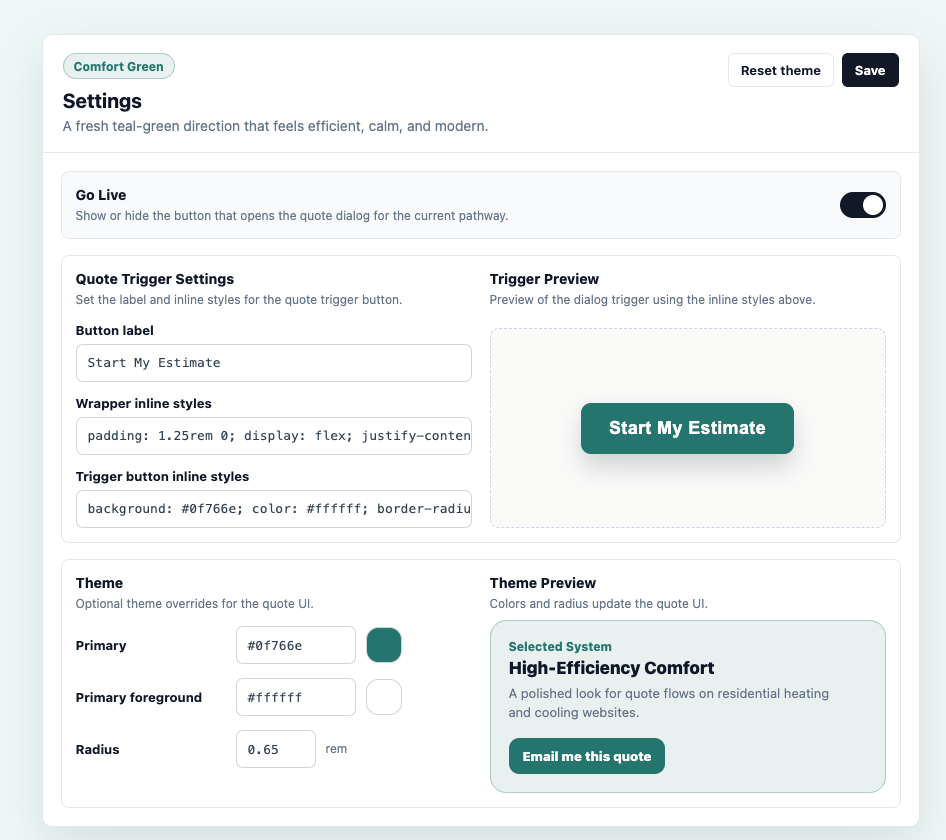
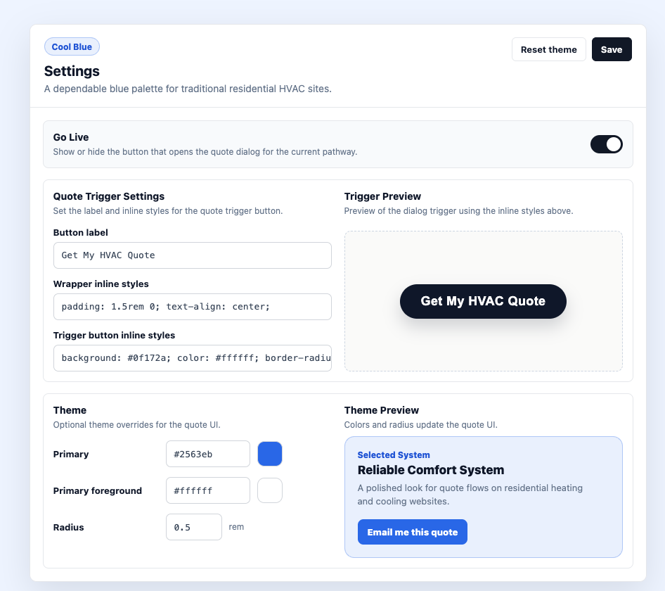
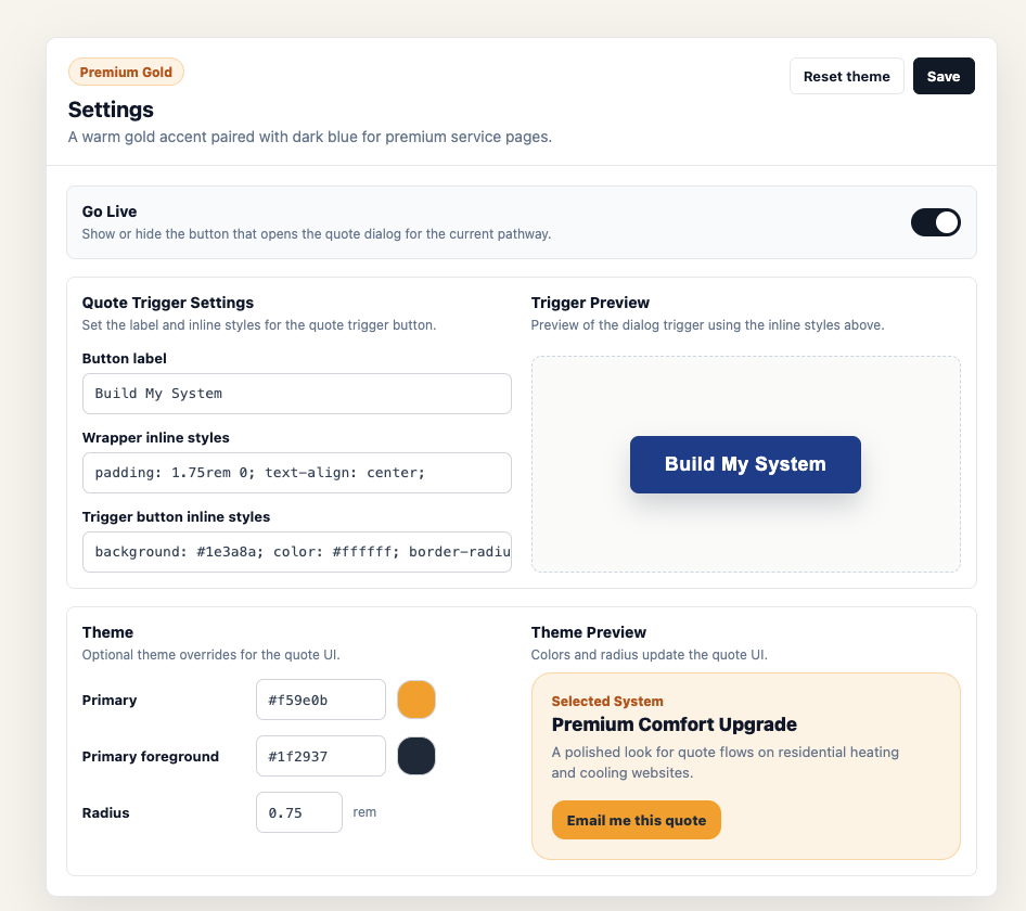
Theme Examples
These examples show how different theme choices can change the feel of the EC Quote experience.
Green
Blue
Gold
Example Styling Recipes
Centered Button
Wrapper inline styles:
css
padding: 1.5rem 0; text-align: center;Trigger button inline styles:
css
background: #111827; color: #fff; border-radius: 999px; padding: 14px 30px;Full-Width Button
Wrapper inline styles:
css
padding: 16px 0;Trigger button inline styles:
css
width: 100%; max-width: 360px; padding: 16px 24px; border-radius: 8px;Click Save after making changes.